The ‘Angelina Jolie’ of analytics
The importance of data visualisation and the analytic storyteller is an area we, as Kiwis, shouldn’t underestimate. We’ve had this marketed to us, often with flashy statements calling us to:
- “Unlock the power of data”
- “Drive your business success with storytelling” and
- “Understand the benefits of effective data visualisation”
We tend to sweep these away, not wanting to buy into the hype. But in doing so, are we missing out on just how valuable these roles can be?
An effective data visualisation and analytic storyteller are equivalent to having Angelina Jolie as the lead actor and Steven Spielberg as the movie director. To the layperson, the audience, much of our memories of these movies are affiliated with just a few of these key elements. These core roles represent the task of communicating the conversion of a base manuscript (we can compare this to our dataset) to a wide audience (target market) reflecting a body of work of several years, thousands of people hours and countless dollars of investment (the data analysis).

At the Department of Statistics – the birthplace of R – we have seen flexibility and creativity in producing plots, figures, and charts, otherwise known as data visualisations, come a long way over the last ten years. One of the reasons for R’s success was and continues to be the user’s ability to have greater control over the construction of visualisations, making these more intuitive and attractive compared to those produced by other statistical programming languages.
Data visualisation is useful from the beginning to the end of the analytic cycle. The human mind has the innate ability to quickly recognise patterns in a visual format, which allows for early exploration in identifying any underlying trends and relationships that can be assessed more formally via statistical tests, increasing the efficiency of both conducting the analysis and interpretation of its subsequent results.
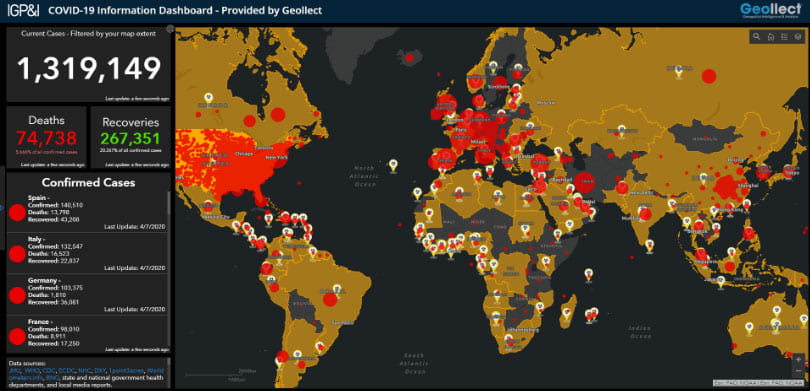
We have observed some impressive data visualisations to date. Perhaps the most recent we can recall are those COVID-19 global projection maps illustrating the vast coverage of the pandemic. Those visualisations were an easy way to communicate a problem across a wide audience that varied by age, gender, ethnicity, socioeconomic status, education, location, and language.
Visualisations will continue to grow in their complexity with interactive graphics and generative art. It is now, however, the powerful combinatory effect of being able to invoke an emotive connection between the pattern – the analysis and the audience via a story that has become of significance, warranting many workplaces looking to appoint a position of ‘Data Analytic Storyteller’.
The analytic storyteller is responsible for creating and communicating a deep narrative centring around our lead actor (our data visualisation). The storyteller tailors the tone, using easy-to-understand terms and language, and targets the presentation to their audience to drive a decision or action a deliverable. Whether your pitch is to a board of CEOs, a classroom of school children or a funding committee for health research, the approach and the importance of the data visualisation and the storyteller are the same.
The end goal is often similar, seeking to facilitate a decision-making process and engage buy-in, be that in terms of investment/funding, marketing or collaboration. Ultimately, we need to have those we present find value in what we do. This makes the selection of the data visualisation by the storyteller best resonate with their viewers, minimising bells and whistles and sticking to something that, within a few moments, conveys the point elegantly and convincingly.
The age-old saying, “A picture tells a thousand words,” really understates the power of a good image. A great visual can not only tell a thousand words but can cross many communication boundaries, language first and foremost. I draw parallels once again to Angelina Jolie, who, in any country and language, is noted as one of the most beautiful faces of the current generation. However, a single visualisation does not need to be a portrait. Long gone are the days of the non-moving bar chart.
Ten years ago, Scott McFarland of the Huffington Post (2014) asked, “If a picture is worth a thousand words, then maybe a moving picture is worth a million people.” An interactive data visualisation (Shiny Apps and Dashboards) allows users to interact and explore how things might change as they alter inputs. This increases the engagement with the audience and is more likely to keep them interested in both the process and the progress of the final product.
So, what difference can a good lead actor/visualisation and director/storyteller make?
That difference can be quite stark.
It’s the difference between a commercial hit and a flop, critical success and failure, funding for a cure for a disease, or a flat decline, an innovative product launch or a Telsa-level invention shelved, a policy change or business as usual.
What you need to ask is, “What is it worth to you? How beneficial is it to you?”
How could Spielberg and Jolie transform your ability to communicate your analytics?
Dr Priya Parmar is a Senior Lecturer and Senior Biostatistician at the Department of Statistics, Faculty of Science, University of Auckland. Priya specialises in neuro-analytics and predictive estimates of the global burden of disease.

